Consider the person using the face
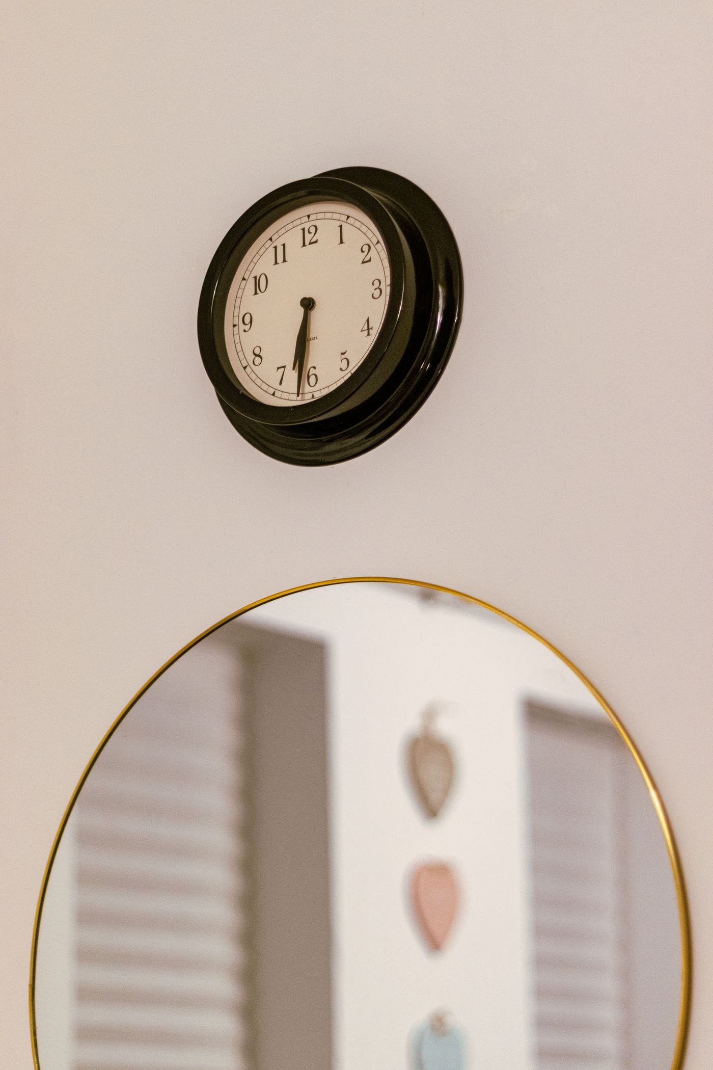
Arabic numbers present the familiar sequence from one to twelve. Roman numerals offer a different visual rhythm, while simple markers leave more interpretation to the position of the hands. None is automatically the right choice for every reader. Consider whether the clock is for a shared room, a visitor space or someone learning to tell the time. Look at the entire dial rather than choosing from a close-up of one numeral. Decorative type can make even ordinary numbers less immediately recognisable.
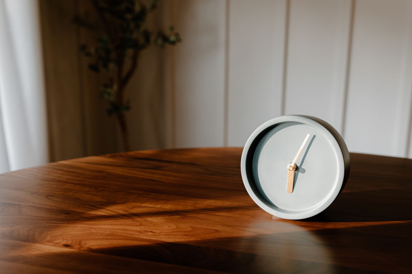
Compare the spaces between markings
Large numerals can crowd a small face, especially when they sit close to the hands. Fine markers may give a cleaner appearance but be difficult to distinguish at the intended distance. Check the minute scale if you want to read more precisely than the nearest broad interval. On Roman-numeral clocks, different designs may show four as IIII or IV; this is a styling variation to notice, not by itself evidence of a fault. The essential practical question is whether the chosen face makes sense quickly to the people who will use it. Compare the same face in the lighting you normally use.
Keep the hands in the decision
A beautifully drawn number set cannot rescue two hands that look almost identical. Compare their lengths, widths and contrast against the dial. View the clock from the expected chair or doorway, under ordinary room light, and at more than one hand position. If shopping online, use a scaled image as an initial filter and seek clearer photographs when markings are hard to distinguish. Avoid relying on a single staged time that keeps the hands neatly away from every numeral. The clock must remain understandable throughout the day.