Separate the dial's jobs
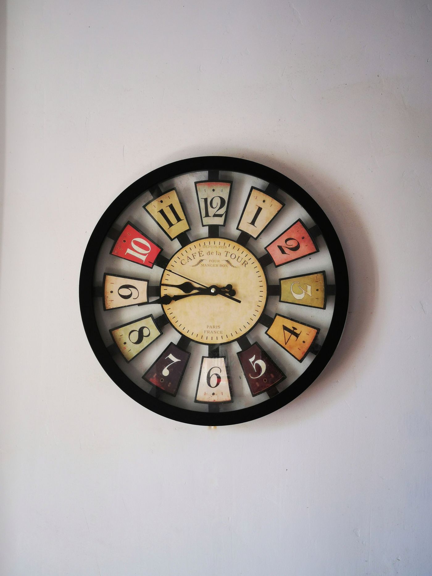
A clock face has to present information and may also carry a decorative pattern. Problems arise when both compete for the same visual space. A narrow hand crossing lettering, flowers or a map can disappear momentarily against similar lines. Look at the whole path of the hands, not just the position chosen for the product photograph. A pale hand may show clearly against one part of a patterned dial and become difficult to follow against another. The minute hand should also remain distinguishable from the hour hand and any decorative counterweight.
Compare contrast at ordinary distance
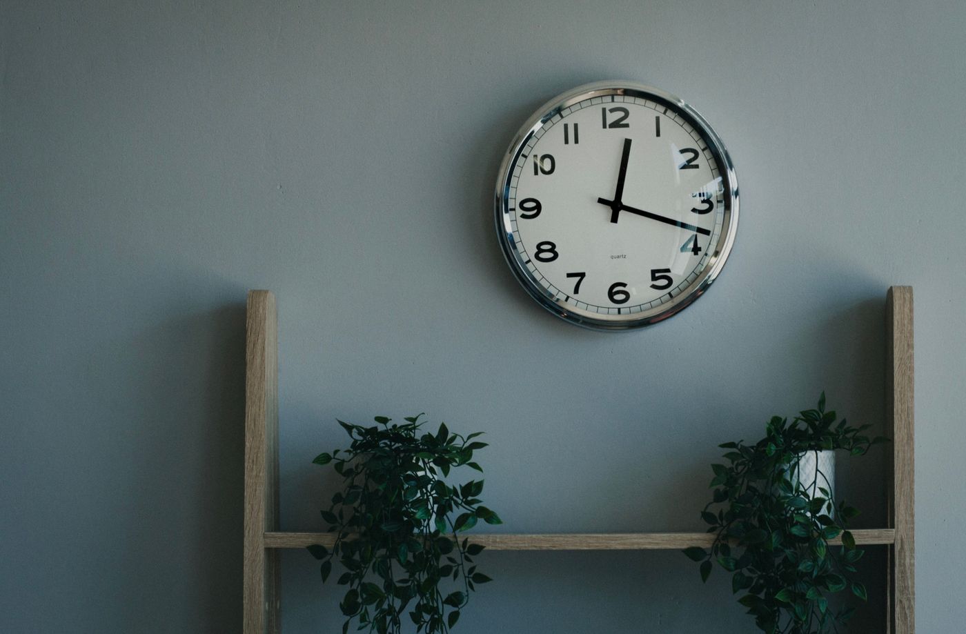
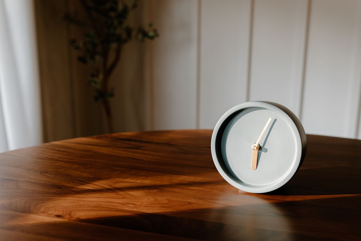
Shrink a product image until the dial appears roughly the size it would from your chair. This is an imperfect screening tool, but it can reveal whether the hands depend on close inspection. Compare it with a plain dial rather than simply choosing the largest numerals available. Metallic finishes deserve particular care: their appearance changes with reflected light, so a bright brass hand in one photograph might look dark in another room. When possible, inspect the clock under ordinary lighting and move to either side. Avoid treating a studio highlight as dependable contrast.
Keep the pattern where it helps
If you enjoy a busy design, consider a clock with a decorative outer case and a simpler central dial. Alternatively, use a patterned clock as an accent where you can read it at short range. That is a different purpose from the main time display across a large room. Do not paint or thicken the hands of a purchased clock merely to improve visibility; extra material can affect clearance and movement requirements. Choosing a more suitable complete design is often the cleaner solution, especially for a new purchase that can still be returned.